
Brand Identity
TORUNLAR GYO
A corporate identity built on strength and trust
Corporate Brand Identities
01
The project
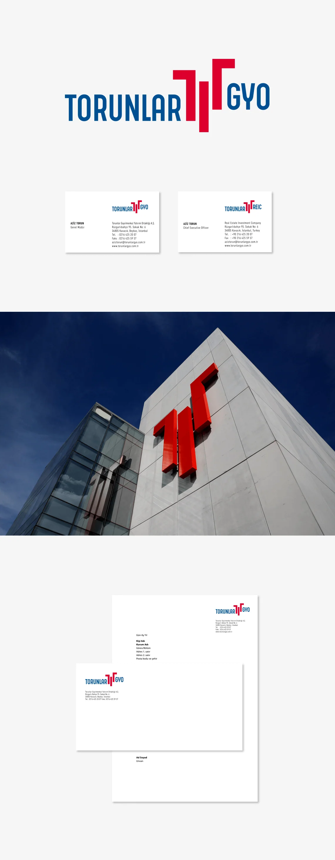
Torunlar GYO wanted its identity to reflect its stable growth and value creation. Blue expressed balance and trust, while red conveyed dynamism and confidence. A symbol built around the letter T connected established values with the ambition to create a better future.
Explore the related service
Brand IdentityMore projects
7 projects
TÜRKİYE İŞ BANKASI
A Finar touch for an emblem of trust
İGA
An identity for İstanbul Airport
VAKIFBANK
A younger, more visible VakıfBank
İŞ BANKASI GRUBU
A shared identity for group companies

GEDİK YATIRIM
A complete identity transformation
İGA İSTANBUL AIRPORT CITY
Building an airport city’s identity

VAKIF EMEKLİLİK
Fresh touches for an established brand